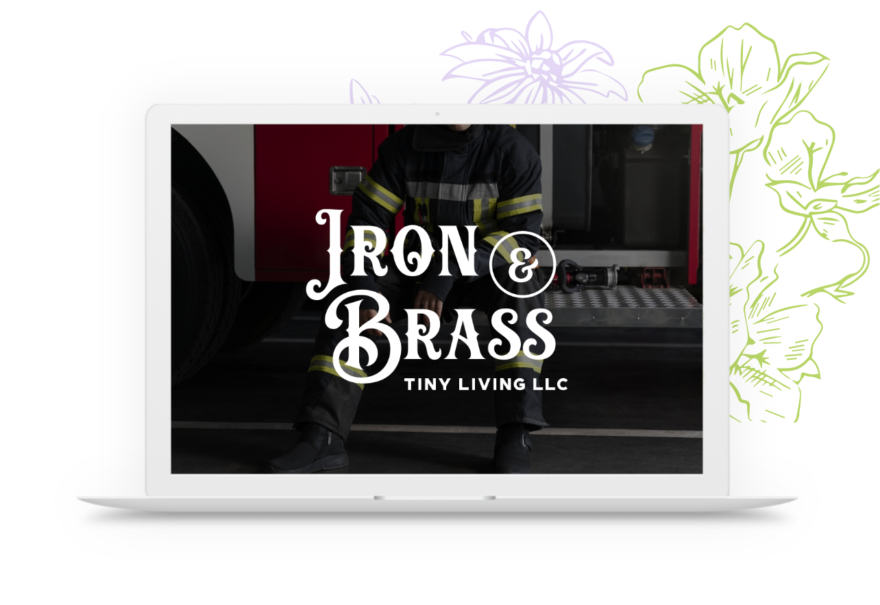
The project’s client, a former firefighter turned tiny house builder, offers affordable, sustainable, and mobile housing solutions. They aimed for a design that subtly referenced their firefighting background rather than overtly focusing on the “Tiny Houses” aspect.
This design was done under contract for Moonlit Media.
Client
Iron & Brass Tiny Living, LLC
Date
April 2020
Skills
Branding, Logo Design, Creative Direction, Adobe Illustrator
The logo.
To honor the client’s firefighting background, I incorporated firemen’s axes into the design. Following their desire for a vintage badge-style logo, I utilized the axe imagery as an accent, allowing typography to take center stage.
The overall style was inspired by the client’s references to 1920s and 1930s gangsters, particularly citing the show “Peaky Blinders.”
The brand.
The font selection was inspired by vintage firefighter memorabilia and logotypes prevalent in the 1920s and 1930s. Specifically steering clear of art deco styles, I opted for sophisticated yet masculine typefaces.
The color scheme derives directly from the name itself, complemented by a rich fire engine red hue for added depth.