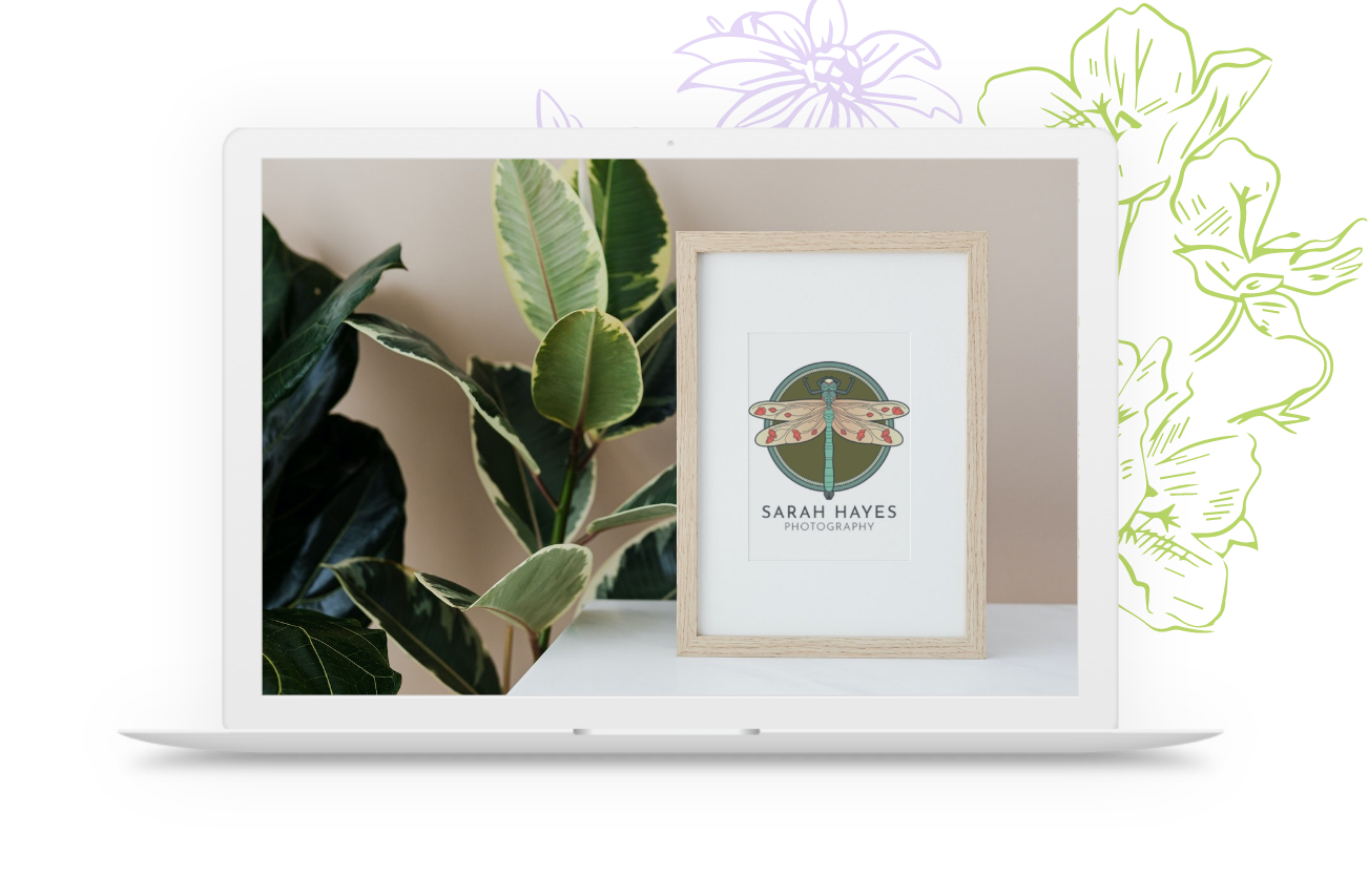
Sarah Hayes, a commercial and Fine Art photographer, sought a custom illustration to embody her artistic prowess. Fascinated by insects, particularly dragonflies, she found inspiration in early 1900s artwork.
This design was done under contract for Moonlit Media.
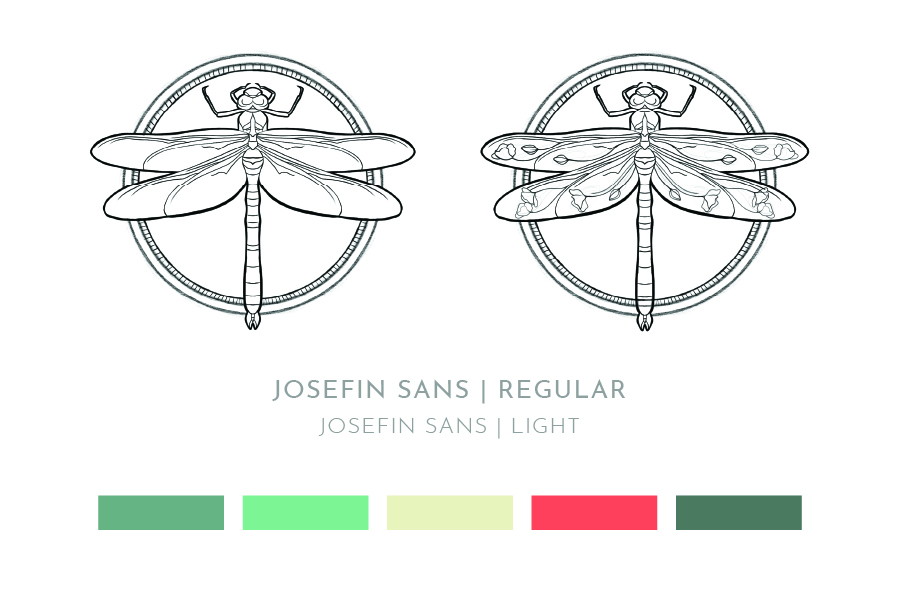
Early in the design process, the concept of the circle resembling a camera lens was integral. Later, the floral elements were incorporated into the design.
The Josefin Sans font family echoes the aesthetic of vintage Art Deco fonts while maintaining a modern touch suitable for the current era.
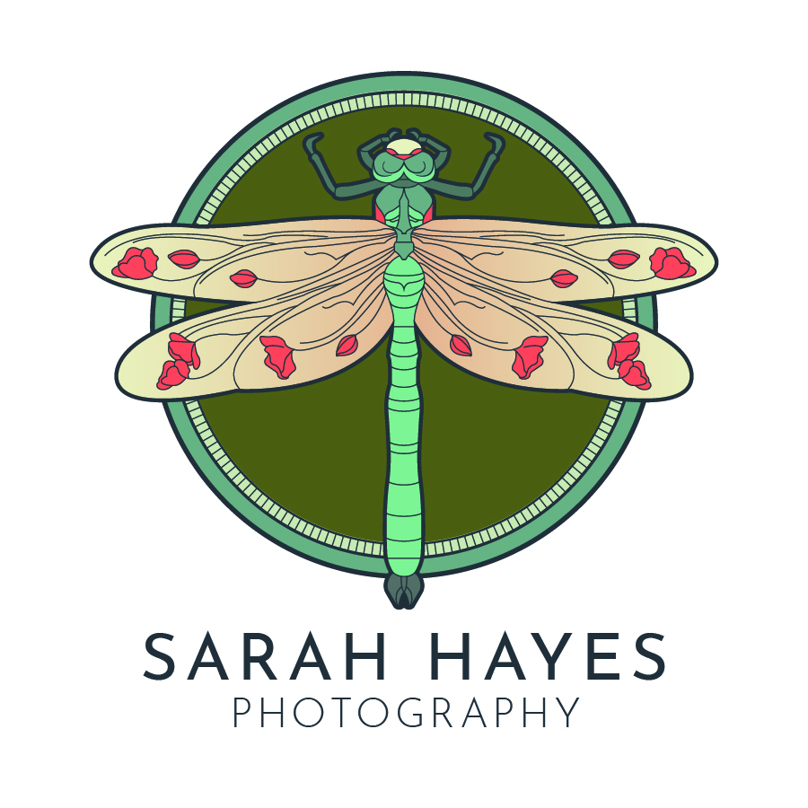
Drawing inspiration from Art Nouveau pieces, both the style and color palette were influenced. While browns and corals were common in that era, the client favored Aquas and Teals. By toning down their vibrancy to evoke a more muted, dusty feel, these colors still captured the essence of the desired decade.
The final look.
Studying the Art Nouveau style inspired the diverse weights within the composition. Bold outlines complement delicate details, while scroll-like flowers were intricately woven into the wings, echoing the era’s floral and whimsical aesthetics.
The background circles serve a dual purpose: symbolizing the aperture and lens of a camera, while also framing the illustration for effortless placement within marketing materials.