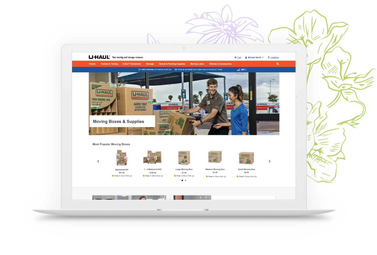
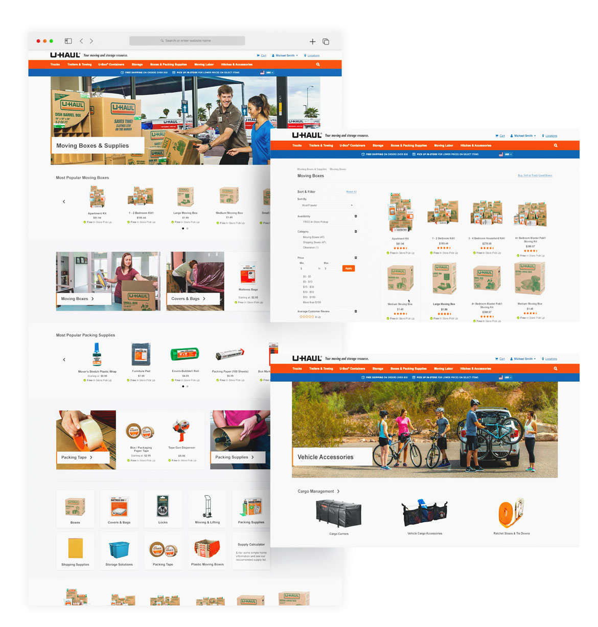
With various sections of the site undergoing redesigns and updates, it became essential to revamp the moving supplies store on uhaul.com. Beyond just aesthetics, we redesigned the store’s layout and flow, aiming for a user-friendly experience that enhances navigation.
Revamping a massive online store for enhanced user experience is no small feat. What’s intriguing is proposing a narrative-driven flow over a purely utilitarian approach. As part of this redesign, the goal was to establish an emotional connection between users and the store, transcending mere transactions. Although U-Haul boasts a strong brand recognition, infusing a warmer, more familial tone into the moving experience, already stressful for many, seemed pivotal. Ensuring a familiar navigational experience was equally important to alleviate this stress, prompting thorough competitor research.
Results.
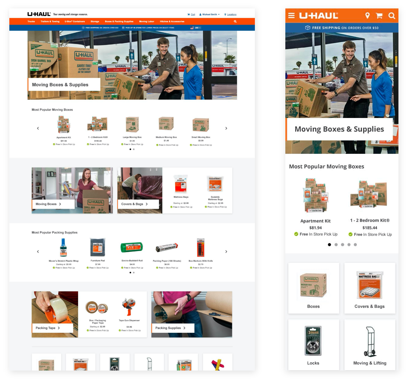
The revamped store layout employs captivating hero images, infusing a friendlier tone throughout. Improved category organization enhances hierarchy and makes scanning effortless. Additionally, the redesign prompted reshoots of lifestyle photos and higher-quality product images, elevating the overall visual appeal of the site.
For smaller viewports, gesture-based navigation—such as swiping carousels—and larger product containers were introduced to enhance white space and improve tap targets.
Certain pages feature infinite product scrolling on larger viewports, dynamically adjusted for smaller screens to streamline page lengths and improve user experience.