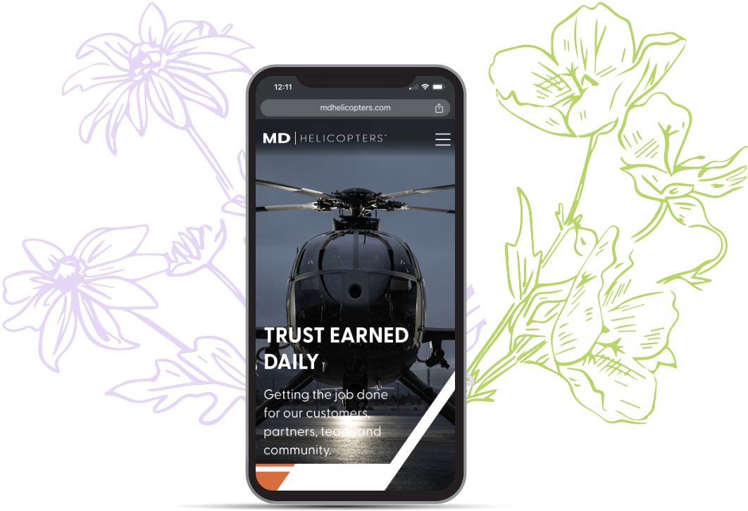
Embarking on the mobile design phase for MD Helicopters’ website redesign, meticulous attention was given to crafting an optimal user experience. With a focus on mobile navigation and the challenge of navigating lengthy product, training, and support pages, a thoughtful approach was taken to enhance the overall mobile journey. The objective was to introduce innovative solutions that would alleviate the challenge of extensive scrolling, particularly on content-rich pages. Simultaneously, the mobile navigation was envisioned to seamlessly mirror the high-level design aesthetics upheld throughout the entire website, ensuring a visually appealing and cohesive user experience.
Part of the MD Helicopter website refresh was crafting an exceptional mobile experience. It was understood that certain product and service detail pages would be lengthy and require plenty of scrolling – this would be compounded 10-fold on a mobile device. I created a specific user journey to track this experience on mobile to back up a potential solution with research.
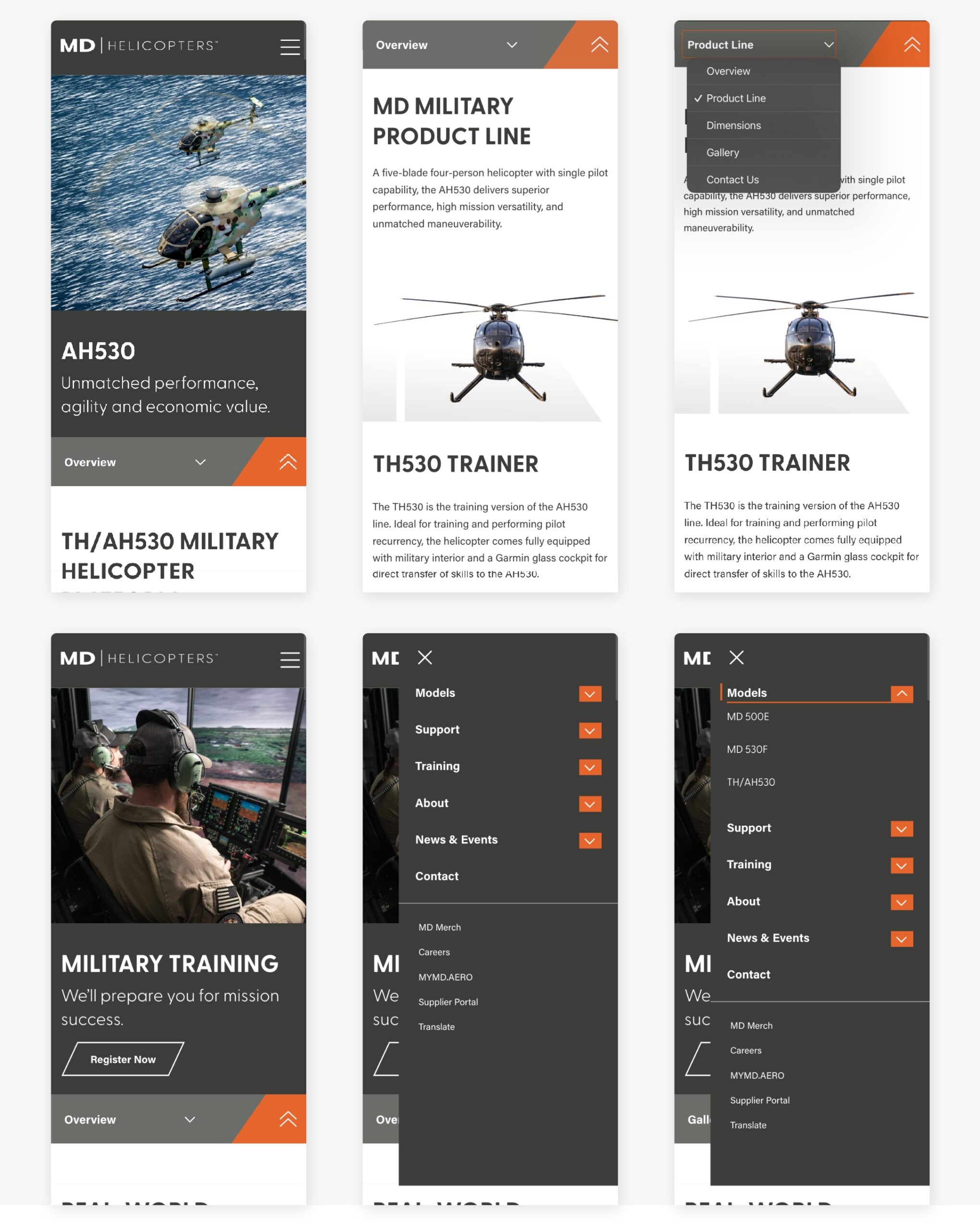
The research resulted in a clear decrease in satisfaction while searching for specific information on the current site. This solidified the need for a secondary level of navigation to break up the length of service and product pages. One caveat to that would be the need to override the main navigation, we would need to ensure that the user can regain access to the main navigation with ease.
Results.
The main mobile navigation now facilitates smooth interaction by incorporating two target points – users can activate the dropdown either by selecting the chevron or tapping the title to navigate to the root page. An engaging feature involves an animated orange line subtly appearing when the dropdown is active, not only adding a pop of color but also establishing a clear active state.
To streamline navigation within content-rich pages, anchor links were employed on the Product, Support, and Training pages, creating a subnavigation menu. The sub-navigation bar now replaces the main navigation as the sticky element, ensuring seamless navigation regardless of the user’s position on the page. A “back to top” button was integrated, offering users swift access to the main navigation. The mobile subnav was designed with a dropdown element to conserve space and leverage natural gestures contributing to a user-friendly mobile experience. As a result, the mobile design successfully addressed the challenges, offering enhanced navigation and improved accessibility, contributing to a positive and efficient user journey.